Global Office Redesign
Link to prototype.png)
Objective
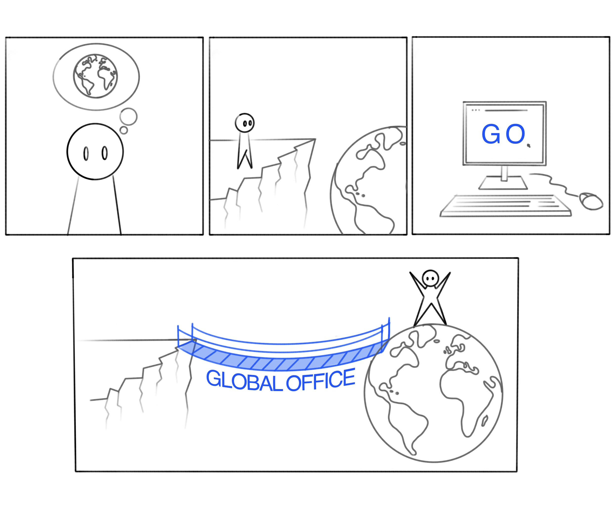
To redesign the Global Office website into a vibrant and user-friendly platform that highlights the full range of services offered and serves as a comprehensive guide for incoming and outgoing students and staff pursuing international opportunities.
What I did
- Strategic Discovery
Conducted desk research, competitor analysis, and user surveys to identify pain points in navigation, content clarity, and visual design. - Behavioral Mapping
Observed user interactions with the existing website to understand scrolling, clicking, and navigation patterns, uncovering areas for improvement. - Usability Testing
Tested prototypes iteratively to refine navigation systems, improve readability, and ensure alignment with user expectations. - Visual Design Optimization
Incorporated vibrant visuals inspired by analogous designs (e.g., color palettes from Stardew Valley and Mario Bros) to evoke a welcoming and engaging atmosphere. - Interactive Features
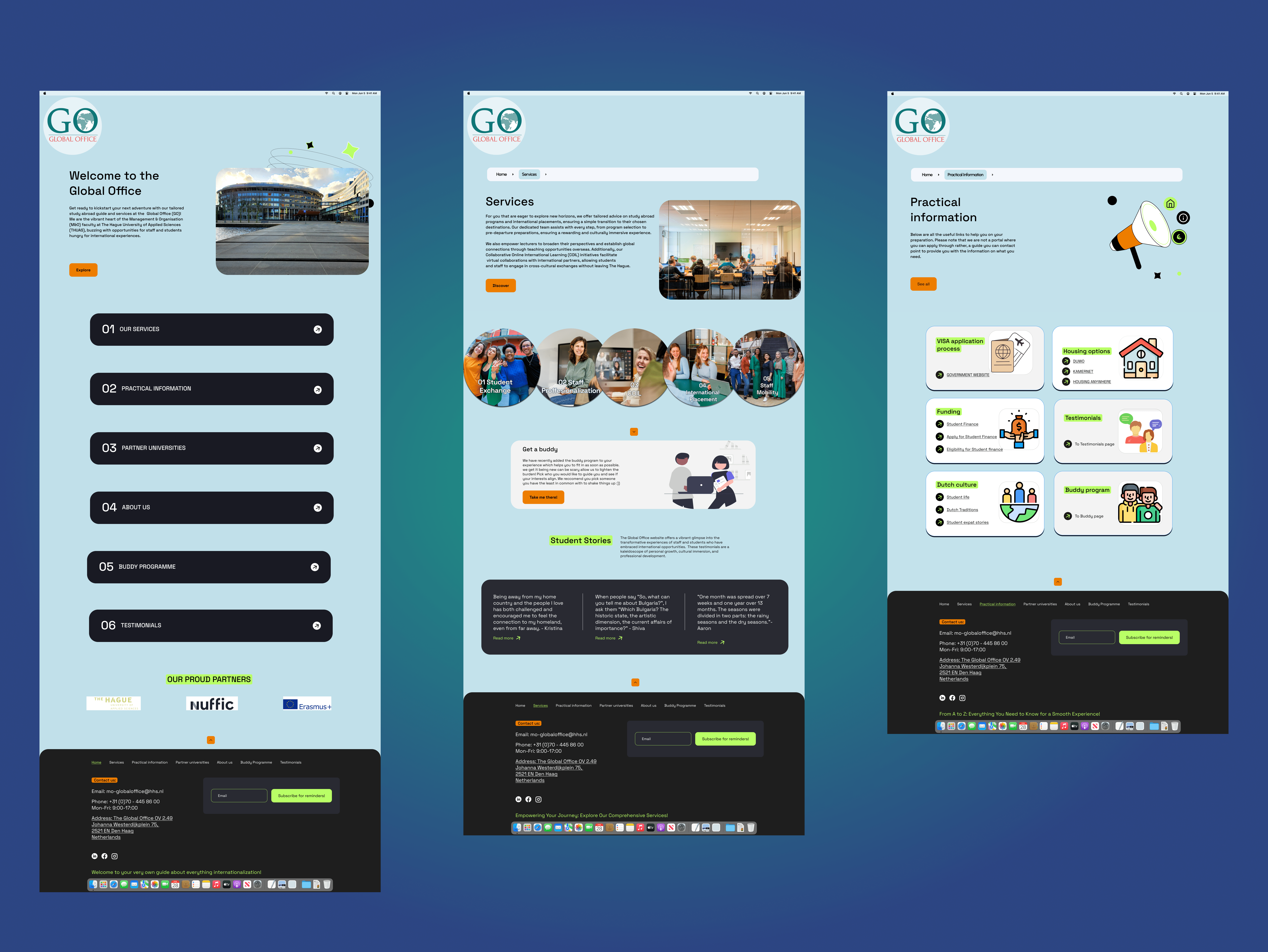
Designed key features such as a buddy system page for onboarding, links to government resources, and practical information pages to streamline user journeys.
Creative Process
- Empathizing Phase
Used the design thinking methodology to uncover user needs through interviews, surveys, and usability testing. This phase revealed challenges in navigation and visual engagement that informed the redesign strategy. - Define Phase
Created problem statements and "How might we" questions to guide ideation, focusing on intuitive navigation, clear guidance, and visually appealing design elements. - Ideate Phase
Explored creative solutions through sketching, analogous inspiration, and out-of-the-box exercises like the "Worst Idea Possible" technique to refine tone and layout concepts. - Prototyping & Testing
Developed interactive prototypes in Figma for realistic user testing, iterating designs based on feedback to align with both user needs and client goals. - Finalization
Delivered a fully clickable Figma prototype featuring clear navigation, vibrant visuals aligned with Delft’s identity, and tools like the buddy system page to enhance onboarding experiences.
Results
The redesigned website successfully:
- Improved navigation by creating intuitive pathways for exploring international opportunities.
- Enhanced visual engagement with vibrant designs that resonate with users' preferences.
- Streamlined onboarding processes with features like the buddy system page tailored to diverse cultural contexts.
- Built trust through practical information pages and partnerships showcased prominently on the platform.
Conclusion
Through research-driven insights and iterative design processes, I transformed the Global Office website into a dynamic platform that empowers students and staff at The Hague University of Applied Sciences to explore global opportunities confidently. The final design reflects both user needs and institutional values while fostering a sense of community relevance.
%20(2).png)